If your website looks “fine” but isn’t converting, design is probably the quiet problem no one wants to talk about.
Not branding.
Not traffic.
Not even copy, at least not first.
In real client projects, we’ve seen solid offers fail simply because the website made users hesitate. A half-second delay. A confusing layout. A button that didn’t feel clickable. Small things, but they stack up fast.
This page breaks down how website design impacts conversions in practical terms, not theory, not trends, not buzzwords. Just what actually moves people from “scrolling” to “taking action.”
Why Website Design Has a Direct Impact on Conversions
Design doesn’t persuade people.
It removes friction.
Every conversion is a micro-decision.
“Do I trust this?”
“Is this worth my time?”
“Do I know what to do next?”
Good design answers those questions instantly. Bad design forces users to think, and thinking kills conversions.
From working with businesses across different industries, one thing is consistent:
People don’t convert when they feel uncertain, rushed, or overwhelmed.
That’s not a copy problem. That’s a design problem.
First Impressions Happen Faster Than You Think
Users don’t “browse” your site at first. They scan it hard.
Within seconds, they subconsciously judge:
- Is this business legitimate?
- Is this relevant to me?
- Does this feel easy or annoying?
Your layout, spacing, typography, and color choices do most of that work. This is why teams that combine design with strategy tend to outperform sites built purely for aesthetics.
If the page feels chaotic, outdated, or unclear, conversions don’t stand a chance.
Visual Hierarchy: The Hidden Conversion Lever
Visual hierarchy determines what users notice first, second, and third. When it’s wrong, even strong CTAs get ignored.
In testing multiple setups, we’ve seen the same content perform wildly differently just by adjusting:
- Headline size and contrast
- Button placement
- White space between sections
If everything screams for attention, nothing gets it.
Good hierarchy:
- Guides the eye naturally
- Makes decisions feel obvious
- Reduces cognitive load
Navigation Design and Decision Fatigue
More options ≠ , better experience.
One common issue we see is overloaded menus. Dropdowns inside dropdowns. Too many pages are competing for attention.
Here’s the uncomfortable truth:
Users don’t want to explore. They want to solve a problem.
Conversion-focused navigation:
- Limits choices
- Uses clear, human language
- Prioritizes revenue-driving pages
When navigation is simplified, bounce rates drop. Conversions climb. It’s boring—but it works.
Mobile Design Isn’t a “Responsive” Checkbox
Mobile traffic dominates for most businesses. Yet many sites still treat mobile as an afterthought.
On real projects, mobile-specific fixes often create the biggest conversion lifts:
- Larger tap targets
- Shorter forms
- Reduced visual clutter
- Faster load times
If users have to pinch, zoom, or hunt for buttons, they’re gone.
This is where platform expertise matters. Whether it’s WordPress Web Development or modern tools like Webflow Development, the platform is less important than how it’s used.
Page Speed Is Design (Not Just Tech)
People often separate performance from design. They shouldn’t.
Heavy animations, oversized images, and unnecessary scripts all slow pages down, and slow pages don’t convert.
From testing client sites:
- Faster pages feel more trustworthy
- Users scroll more
- Forms get completed more often
Clean design isn’t just about looks. It’s about restraint.
This is especially critical for ecommerce builds using Shopify Web Development in Portland or Magento Web Development in Portland, where milliseconds directly affect revenue.
Trust Signals Built Into Design
Trust isn’t established by a single testimonial. It’s cumulative.
Design communicates trust through:
- Consistent spacing and alignment
- Professional typography
- Real photos instead of stock overload
- Clear contact information
A site built by an expert web development agency often feels different because these details aren’t accidental; they’re intentional.
If users feel even mild skepticism, they hesitate. And hesitation kills conversions.
Call-to-Action Design That Actually Works
CTAs don’t fail because of wording alone. They fail because they’re badly designed.
Common issues:
- Buttons blending into the background
- Too many CTAs competing
- Poor placement
In real client projects, we’ve seen stronger results from:
- One primary CTA per page
- High contrast buttons
- Clear spacing around actions
The CTA should feel like the natural next step, not a pushy demand.
Forms: Where Most Conversions Die
Forms are conversion bottlenecks. Design can either reduce friction or amplify it.
What we’ve learned:
- Fewer fields almost always win
- Inline validation reduces abandonment
- Clear labels beat clever placeholders
Designing forms is about empathy. What would you tolerate filling out on your phone?
Sites that integrate this thinking across SEO and paid traffic see better ROI across channels.
Design Consistency Across Marketing Channels
Design doesn’t exist in isolation.
If someone clicks an ad, the landing page design must match expectations. When it doesn’t, conversion rates tank even if the offer is solid.
This is especially obvious with PPC traffic. Teams running campaigns often see big performance swings from landing page redesigns alone.
Same message. Same offer. Better design. Better results.
Social Proof Placement Matters More Than Quantity
Five testimonials in the footer won’t move the needle.
Where you place social proof matters more than how much you have:
- Near CTAs
- Before pricing sections
- At moments of hesitation
Design controls when reassurance appears, not just if it exists.
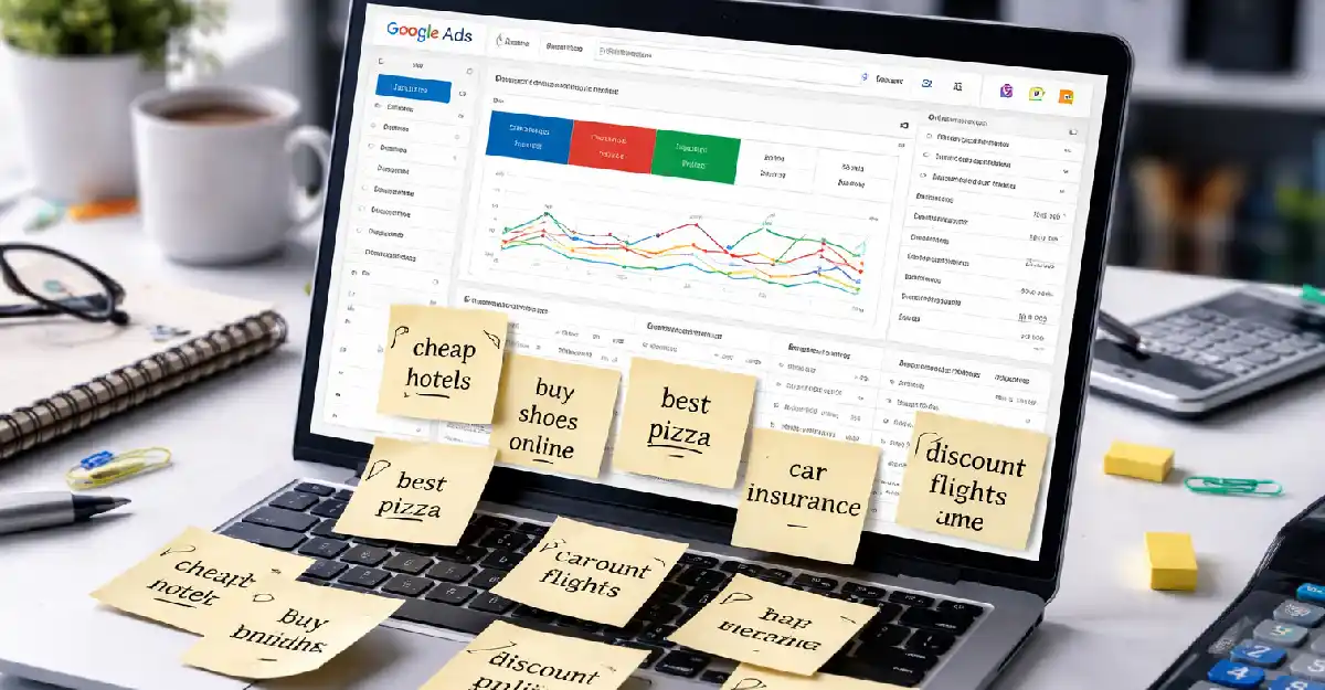
This applies equally to organic traffic and paid channels like Meta & Google Ads.
Design for Clarity, Not Creativity
This might sound harsh, but it’s honest.
Some of the worst-converting sites we’ve audited were beautifully creative. Stunning visuals. Clever interactions. Zero clarity.
Design should never make users ask:
“What am I supposed to do here?”
High-converting sites prioritize:
- Clear messaging
- Predictable layouts
- Familiar patterns
Creativity has its place, just not at the cost of comprehension.
Design and SEO Are More Connected Than You Think
Design choices affect:
- Bounce rate
- Time on site
- Page depth
All behavioral signals that search engines notice.
A clean, fast, readable design supports SEO performance—especially when paired with structured efforts.
If users stay longer and engage more, rankings tend to follow.
FAQs
Does website design really affect conversions?
Yes directly. Design influences trust, clarity, speed, and usability, all of which determine whether users take action or leave.
What design elements have the biggest impact on conversions?
Visual hierarchy, page speed, CTA placement, mobile usability, and form design consistently show the strongest influence.
Can redesigning a website improve conversion rates without changing copy?
Absolutely. In many cases, redesigning layout and structure alone leads to noticeable conversion lifts.
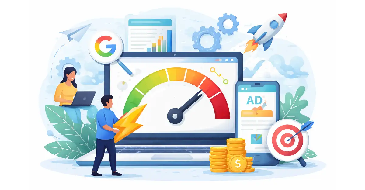
How does website design affect paid advertising performance?
Landing page design plays a major role in Quality Scores, bounce rates, and conversion costs, especially for PPC and social ads.
Should design focus more on branding or usability?
Usability first. Branding supports conversions only when it doesn’t interfere with clarity or user flow.
Final Thoughts
So, how website design impacts conversions isn’t a mystery; it’s measurable.
Design shapes how users feel, think, and act. When it’s intentional, conversions feel easy; when it’s not, even the best traffic struggles to perform.
If you’re questioning whether your site is helping or hurting results, that’s usually a sign it’s time for an honest design review.
And if you need a second set of experienced eyes, you can always contact Codevelop, a Portland Digital Marketing Agency that understands design as a growth lever, not just a visual layer.